This article was first published in a slightly modified form on my blog.
About a few months ago #divtober , a project where you draw images with pure CSS and only one DIV , ended — at least for 2020. The project was first initiated by Lynn Fisher. On her website she presented her contribution to #divtober. An amazing collection of CSS art! It’s even more impressive once you know that these quite complex and detailed clipart-like images were drawn with only a single DIV and pure CSS, meaning no preprocessor like SASS/SCSS, no images, no SVG. Only CSS and a single DIV — the minimum amount of HTML needed to draw an image with CSS.
The first thing one might ask is „Why?“. The reason I do it is because limiting myself on a small subset of tools forces me to get to know these tools as much as I can, so I can push it to its limit. Limiting myself on only CSS forces me to get to know CSS in a much deeper way. You might think you know CSS, but after reading this article you’ll learn things you probably didn’t know before. And as Interhyp is an aspiring technology leader, I think it’s important that the people working here not only should know the tools they are using well, but should know them perfectly.
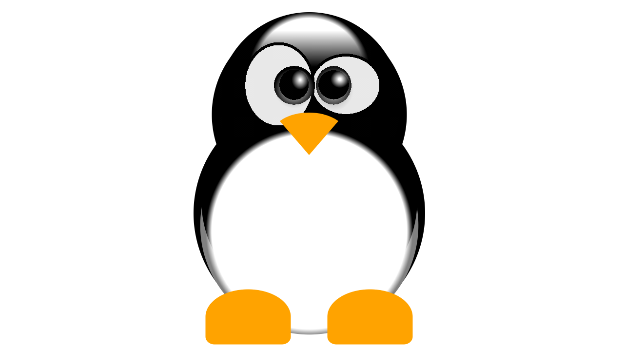
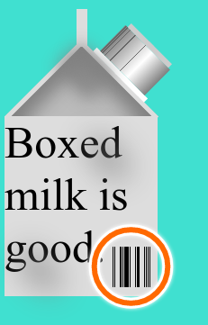
I also have a small collection of single DIV CSS art myself. The cover image of a the Linux Tux, for example, drawn with only one DIV and pure CSS only. In this article I’ll explain to you the secrets of how you can draw an image with pure CSS and only one single DIV.
It all starts with a <div/>. That’s the minimum amount of HTML element you’ll need in order to apply CSS on it. Drawing CSS with a single DIV usually means exploiting every means that can be used to create any shape or form in order to realize your ideas. Just like in a traditional painting, the more manifold your brushes are, the better the outcome will be. And CSS offers you more shapes and forms you initially thought possible with only one DIV.
Box shadow
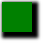
Let’s start with a simple one. If you have used CSS before, you probably know about the box-shadow attribute. In the following case you create a box shadow that is, by default, black and has an offset of 10px to the left and to the top with a blur and spread radius of 10px respectively.
div {
  width: 100px;
  height: 100px;
  background-color: green;
  <strong>box-shadow: 10px 10px 10px 10px;</strong>
}
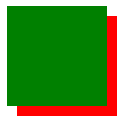
With only a few modifications to the above code, i.e. by setting the blur and spread radius to 0px, you can simulate a second element, because reducing the blur and spread radius you make the border of the shadow edged and thus creates the illusion of an additional element.
div {
  width: 100px;
  height: 100px;
  background-color: green;
  box-shadow: 10px 10px 0px 0px red;
}
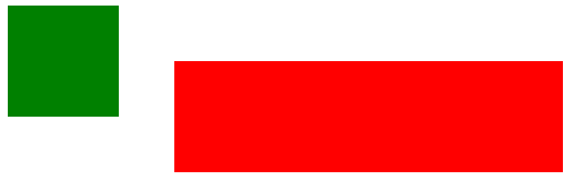
The box-shadow attribute can take as many values as you want. By changing the color and the position you can create the illusion of as many additional elements as you want:
div {
  width: 100px;
  height: 100px;
  background-color: green;
  box-shadow: 10px 10px 0px 0px red,
    23px 200px 0px 0px blue,
    140px 90px 0px 0px yellow,
    250px 40px 0px 0px pink;
}
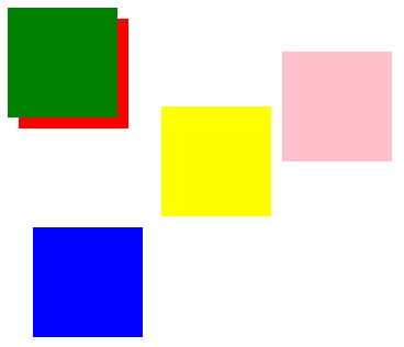
Ok, cool. But why would you want to have lots of colorful boxes. Can you really draw with it? Technically yes. Because they are basically pixels. And computer games are drawings made by pixels. Here is an example of an CSS image made only with box-shadows, aka. pixels that are also animated.
Though possible, drawing a whole picture with only pixels that you individually must set its position is too tedious and lacks the sophistication most people admire about single DIV art. However, you can combine them to create different figures other than the parent element:
div {
  width: 100px;
  height: 100px;
  background-color: green;
  box-shadow: 150px 50px 0px 0px red,
    250px 50px 0px 0px red,
    350px 50px 0px 0px red,
    400px 50px 0px 0px red;
}
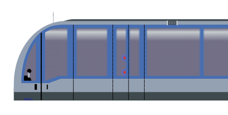
That’s a technique I frequently use. In my MVG-U-Bahn (Munich’s subway) drawing, I used a single vertical stroke to basically create all vertical strokes you see in the drawing:
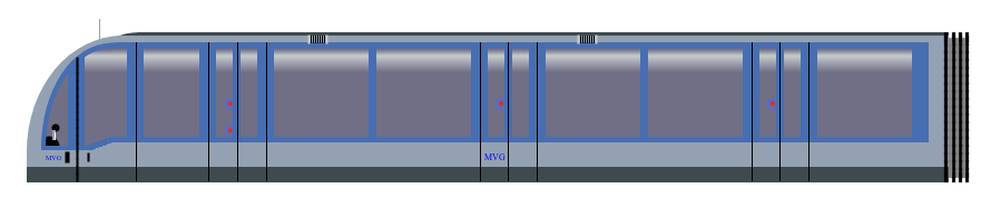
To exemplify, I zoomed in and marked the part as red that was used to replicate all other vertical lines:
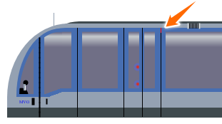
The lines below and in parallel are just box shadows of that single line. 🙂 As you can see a simple but powerful technique.
Pseudo elements
When people think single DIV arts they assume you only have one element to design and puzzled how you could “draw” an image just by using one element. Well, that assumption is not quite true. You always get two so called pseudo elements, before and after that you can style — just like any other DIVs. The only difference is that you must set the content attribute with any string and you must set the position attribute:
div {
  width: 100px;
  height: 100px;
  background-color: green;
}
div::after {
  content: "";
  width: 100px;
  height: 100px;
  background-color: red;
  position: absolute;
  top: 50px;
  left: 50px;
}
Usually you must set an empty string unless you want to use the content string as a means to design as well. But more on how to use strings as a means for designing your single DIV CSS drawings later.
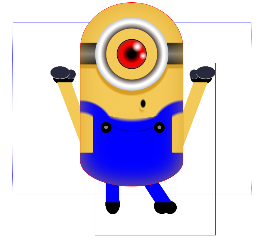
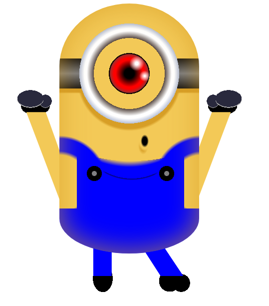
In nearly all my CSS drawings I would use pseudo-elements. They are the most essential part of single DIV CSS art. To show you where these elements are, I marked these elements in my Minion drawing: The red bordered element is the DIV. The green bordered element is the before pseudo-element. And the blue bordered element is the after pseudo-element.
You can style each pseudo-elements just like any other DIV and use all the techniques available for any other DIV.
Linear gradients
You might ask: “How can you draw images with only using pseudo-elements and box-shadows? How to achieve those metallic or glossy effects?”
You may have guess it, they are created using CSS linear gradient. Linear gradient is a value of the attribute background-image . With linear gradient alone you can create a plethora of amazing effects. As a starter:
div {
  width: 100px;
  height: 100px;
  background-image: linear-gradient(red, yellow);
}
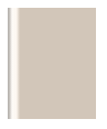
By changing the angle and setting how much percent a certain color should fill the DIV you can create cool effects like a metallic or glossy shining appearance:
div {
  height: 100px;
  width: 100px;
  background-image: linear-gradient(to right, rgba(115, 107, 98, .5) 1px, rgba(253, 247, 240, .5) 4px, #fdf7f0 8px, #d2c6b9 11px, #d2c6b9 37px, #d2c6b9 80px, transparent 80px, transparent 215px, #d2c6b9 215px, #d2c6b9 264px, #d2c6b9 286px, #fdf7f0 291px, rgba(253, 247, 240, .2) 295px, rgba(115, 107, 98, .4) 299px);
}
What most people don’t know is you can add as many linear gradients as you want. Also, you can also create hard edged lines without gradients with linear gradient, too. For example I used multiple linear gradients to create the barcode shown below:
First I created two horizontal non-transparent bars. And in between one horizontal transparent bar. This can be achieved with one linear gradient:
div {
  height: 200px;
  width: 200px;
  background: linear-gradient(#ddd 145px, transparent 145px, transparent 190px, #ddd 190px);
}
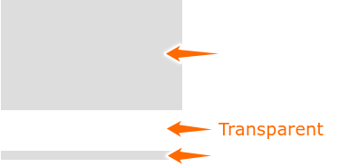
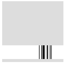
Next I would add vertical lines to achieve the illusion of barcodes. As you can see, you can create hard edged lines by end of a color to the same position as the next color. If end point of one color is the same as the start point of the next color, you create the illusion of a hard edged line:
div {
  height: 200px;
  width: 200px;
  background: linear-gradient(#ddd 145px, transparent 145px, transparent 190px, #ddd 190px), linear-gradient(90deg, transparent 120px, black 120px, black 121px, transparent 121px, transparent 122px, black 122px, black 123px, transparent 123px, transparent 128px, black 128px, black 130px, transparent 130px, transparent 131px, black 131px, black 132px, transparent 132px, transparent 133px, black 133px, black 138px, transparent 138px, transparent 139px, black 139px, 140px, transparent 140px, transparent 145px, black 145px, black 146px, transparent 146px, transparent 147px, black 147px, black 150px, transparent 150px, transparent 155px, black 155px, black 156px, transparent 156px, transparent 157px, black 157px, black 158px, transparent 158px, transparent 159px, black 159px, black 160px, transparent 160px, transparent 161px, black 161px, black 162px, transparent 162px);
}
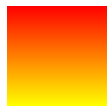
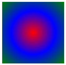
Radial gradients
Besides linear gradients, you can also use radial gradients as value in the background-image attribute. Similar to linear gradients, you can set the position, the color and the color spread individually:
div {
  height: 200px;
  width: 200px;
  background: radial-gradient(circle at center, red 0, blue, green 100%);
}
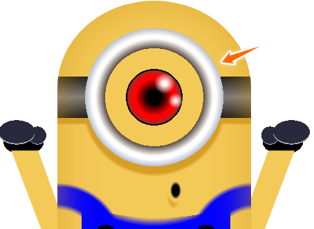
For example I drew the glasses, eye, pupil, and the light reflection of this minion with radial gradients only:
Background size
We talked a lot about background-image . But did you know you can use the background-size as a mean to draw as well? Resizing the background-size means to increasing the number of elements that you drew in background-image . For example the following code creates one circle
div {
  width: 100px;
  height: 100px;
  background: radial-gradient(circle, white 10%, transparent 0%), green;
  background-size: 100% 100%;
}

By reducing the background-size from 100% to 50% you can duplicate the background-image :
div {
  width: 100px;
  height: 100px;
  background: radial-gradient(circle, white 10%, transparent 0%), green;
  background-size: 50% 100%;
}

I applied this technique on the following drawing of an Android:

The eyes of the Android is just one circle drawn with radial-gradient . By simply changing the background-size I could create 2 replicas of the background-image .
Letters
If you inspect the code of the Android careful enough, you’ll see that it is drawn with all the techniques I explained here so far. Except for one: Letters. For this you need a little bit creativity. It’s a technique I seldom see in other drawings. I don’t know why people don’t use it, but I use it quite a lot. For the antenna of the Android, I added a "\000a0V” in the content value of one of the pseudo-elements. The V stands for the two antennas. The \000a0 stands for non-breaking space. I use this to position the letters vertically. In order to position it horizontally you can use \A . This adds a line break.
Another way of using letters as a mean to design is using certain symbols. For example the steering wheel of this racing car is actually a letter — a “Right Semidirect Product” (don’t ask me what this letter is used for. If you know, then comment below. I’d be interested to know):
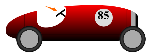
That letter is encoded with \22cc and looks like this:

Another example is the minion drawing. The legs are actually of the letter k and the arms are of the letter v :
By adding letters in the content attribute of a pseudo-element, I can create more complex shapes and forms in order to complement the drawings.
Reflection
There are more CSS attributes you can use to make your CSS art even more appealing, e.g. reflection. It’s actually quite simple. CSS offers you an attribute for that: box-reflect . It mirrors the element that was applied to horizontally:
div {
  width: 100px;
  height: 100px;
  background-color: green;
  border-bottom-right-radius: 50px;
  border: 1px solid blue;
  -webkit-box-reflect:
      below 0px
      -webkit-gradient(linear, left top, left bottom,
         from(transparent), color-stop(5, transparent), to(white));
}
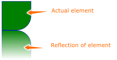
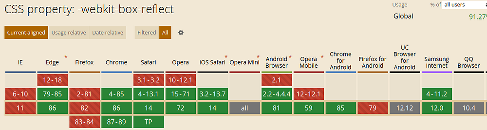
Here is an example where I used this property. As you can see by the vendor prefix, it’s not CSS standard and should not be used in production code. It also doesn’t have full browser support as you can see here on caniuse.com:
Conclusion
CSS offers you more than just a DIV element. There are ways to create other elements out of a single DIV. One of them are pseudo-elements. They are essential when drawing CSS. Using new and experimental like. Last but not least, you can enhance your drawings by using letters.
In general CSS art is not meant for production as the techniques I showed you aren’t responsive on all browsers. Therefore, some drawings can look botched on different browsers or screen sizes.
But drawing CSS art helped me cultivate my creativity and along the way I learned cool new features I didn’t know before.
Do you also draw single DIV CSS images? Share your work here. Or do you have another technique that I didn’t mention in this article? Let me know and comment below. Either way, I hope to see all of you next year in #divtober2021.